Contents
Through the previous study, you should have completed the scaffolding and understood the basic concepts of React. In this section, we will learn to use the Ant Design component library to create a card component (card).

Introduce Antd
Ant Design is a design system that serves enterprise-level products. The component library is its React implementation. Antd is released as an npm package for developers to install and use.
In umi, you can open the Antd plugin by configuring Antd in the plugin set umi-plugin-react. The Antd plugin will help you import Antd and implement on-demand compilation.
export default {
  plugins: [
    ['umi-plugin-react', {
      antd:true
    }],
  ],
  // ...
}
If you use our scaffolding, Ant Design already comes with it, otherwise you need to install it yourself.
# The directory where the scaffold is located
$ npm install antd --save
Use antd
In the previous chapters, we have initialized a scaffold based on umi. You can start it in the following ways:
# Actually executed umi dev
$ npm run dev
Open the browser and visit http://localhost:8000/helloworld . You should see hello world displayed.
The source code corresponding to this page is here page/helloworld.js, and the existing code is probably as follows.
export default ()=>{
  return <div>hello world</div>;
}
Next, we start to introduce Ant Design components for this page. First, add a line to the head of the page.
import { Card } from'antd'; This line of code represents the introduction of the Card component from antd.
Next, change the default hello world output by the module to the following:
export default ()=>{
  const style = {
    width: '400px',
    margin: '30px',
    boxShadow: '0 4px 8px 0 rgba(0, 0, 0, 0.2)',
    border: '1px solid #e8e8e8',
  };

  return (
    <Card style={style} actions={[<a>Cancel</a>, <a>OK</a>]}>
    </Card>
  );
}
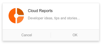
In the above code, we introduced the Card component, and customized its style and the two buttons below. The display effect of the page is as bellow:

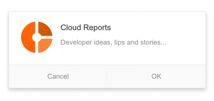
Next, in <Card> the write internal components of a sub-assembly <Card.Meta>, which is provided by antd, specific API can view the official documentation. The complete code is as follows.
import { Card }from'antd';

export default ()=>{
  const style = {
    width: '400px',
    margin: '30px',
    boxShadow: '0 4px 8px 0 rgba(0, 0, 0, 0.2)',
    border: '1px solid #e8e8e8',
  };

  return (
    <Card style={style} actions={[<a>Cancel</a>, <a>OK</a>]}>
      <Card.Meta
        avatar={<img
          alt=""
          style={{ width: '64px', height: '64px', borderRadius: '32px' }}
          src="https://cloudreports.net/wp-content/uploads/2019/07/cloudreports-logo-small.png"
        />}
        title="Cloud Reports"
        description="Developer ideas, tips and stories..."
      />
    </Card>
  );
}


Discussion about this post