Contents
- 1 Comparison of Ubuntu 22.04 vs Ubuntu 20.04
- 1.1 Support period
- 1.2 Logo and Branding
- 1.3 Highlight color
- 1.4 Desktop wallpaper
- 1.5 Lock Screen
- 1.6 Appearance settings
- 1.7 Gnome 42
- 1.8 Multitasking
- 1.9 Linux Kernel Version
- 1.10 Customize the Dock Panel
- 1.11 Screenshot tool
- 1.12 File manager
- 1.13 App center
- 1.14 Firefox now available with Snap
- 1.15 Location of shortcuts
- 2 Conclusions
The debut of Ubuntu 20.04 was remarkable, with a slew of intriguing new features. Many graphic changes have occurred as a result of the default usage of Gnome 3.36 in this edition of Ubuntu. Now that Ubuntu 22.04 will launch with Gnome 42, we should anticipate cosmetic enhancements as well.
However, not everything is as it appears. Ubuntu 22.04 may provide a slew of intriguing new features. In this post, we will compare Ubuntu 20.04 versus 22.04 to help you decide if it is worthwhile to upgrade.
Comparison of Ubuntu 22.04 vs Ubuntu 20.04
Support period
Without a doubt, both editions of Ubuntu LTS (with a long support period). You may use any of them for at least another couple of years if you wish. Ubuntu 22.04 will be supported for five years, until April 2027. While Ubuntu 20.04 will be maintained until the year 2025. This implies you’ll get software upgrades for three or more years.
Logo and Branding
The color magenta was chosen for switches, sliders, and other similar features in Ubuntu 20.04. The makers of Ubuntu 22.04, on the other hand, picked a different hue and modified the theme of the icons.
The new Ubuntu 22.04 logo is odd, and there is no longer a fresh logo file that can be added into the images. Here’s a glance at the new logomap’s animation:
At the same time, the Ubuntu 20.04 logo is free of rectangles.

As a result, the loading animation has been updated to reflect the new logo.
Highlight color
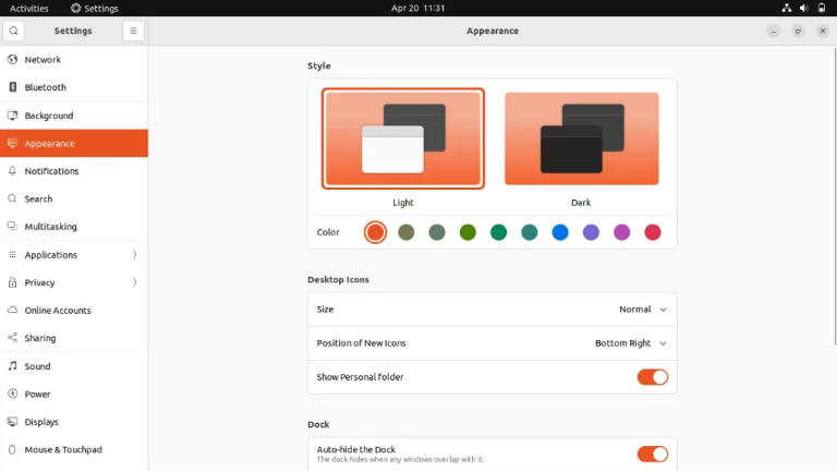
The highlight color and other UI components are not customizable in Ubuntu 20.04. I have no choice but to utilize Gnome Tweaks or go with the original settings. You may change the color of highlights and design components directly in the system settings in Ubuntu 22.04:
Desktop wallpaper
The new Ubuntu 22.04 desktop wallpapers, as expected, correspond to the release’s codename. The wallpaper depicts the codename 22.04 – Jammy Jellyfish:

The codename for Ubuntu 20.04 is Focal Fossa, which refers to a predator from the genus of cats found in Madagascar:
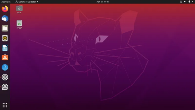
Both desktop backgrounds are almost the same hue.
Lock Screen
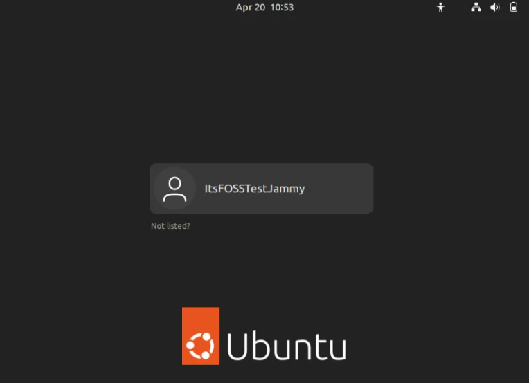
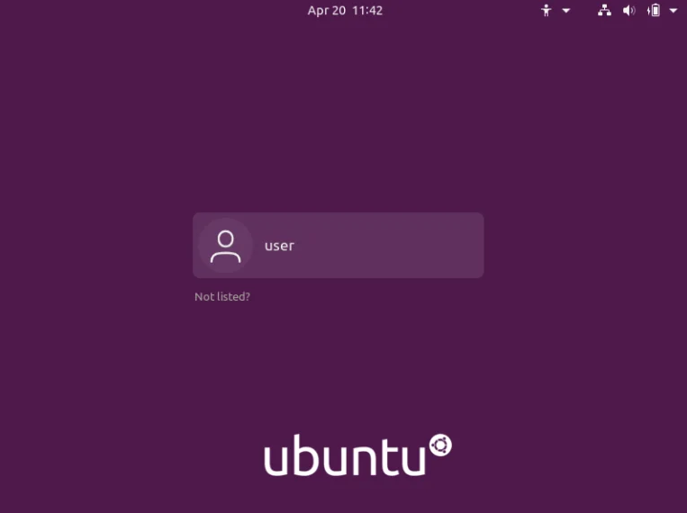
Because the system’s color palette has changed, the enter and lock screens have also altered. In both circumstances, the lock screen image is a fuzzy version of the desktop wallpaper.
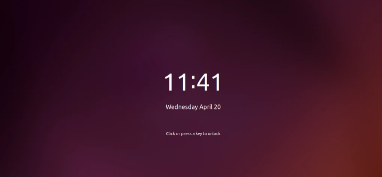
Furthermore, Ubuntu 20.04 offers a darker version:
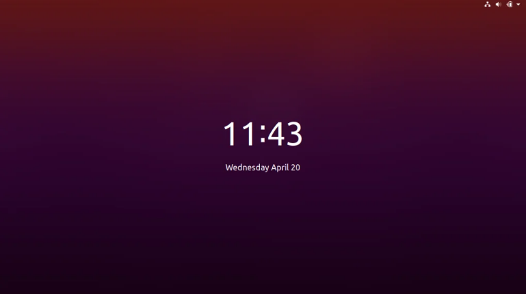
The lock screen in Ubuntu 22.04 is significantly altered. It now has a dark background. This is how it appears:
And so it was in Ubuntu 20.04:
Appearance settings
To meet modern requirements, Ubuntu 20.04 adds support for dark mode. The dark theme in Ubuntu 22.04 has been updated to enable a full-fledged dark mode for the complete system.
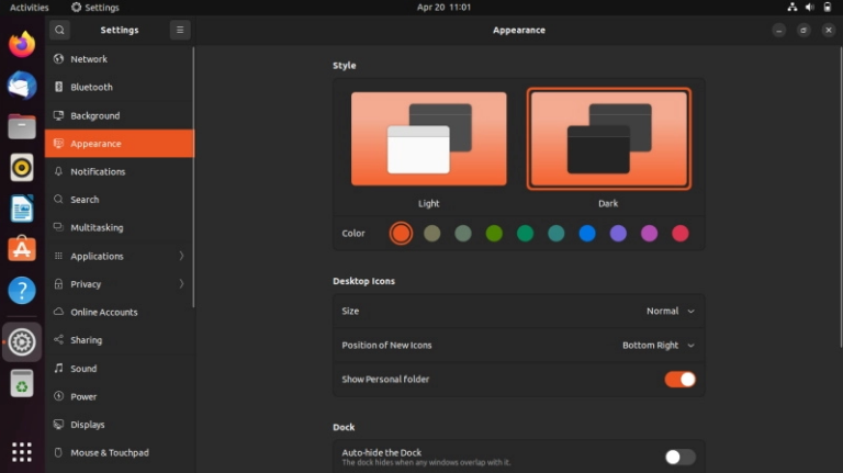
The look settings have also been totally changed to provide you with more options and organize them better. You may also note that Ubuntu no longer has a single default theme. You can now pick between a light and a dark style.
Gnome 42
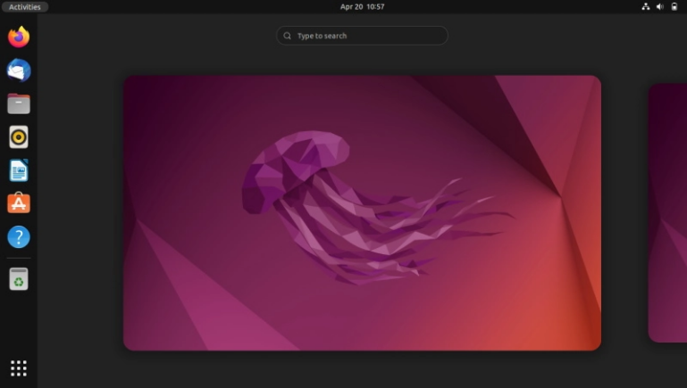
Ubuntu 20.04 has the Gnome 3.36.8 environment, which includes a familiar interaction method and a limited range of visual options. Gnome 42 adds a new dark mode and more cosmetic settings. However, not only are there cosmetic changes in this version of Gnome, but the entire workflow will feel different. The Activities menu, as well as the application menu, have been modified. The Activites menu now looks like this:
And Ubuntu 20.04 had:
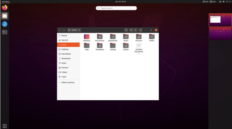
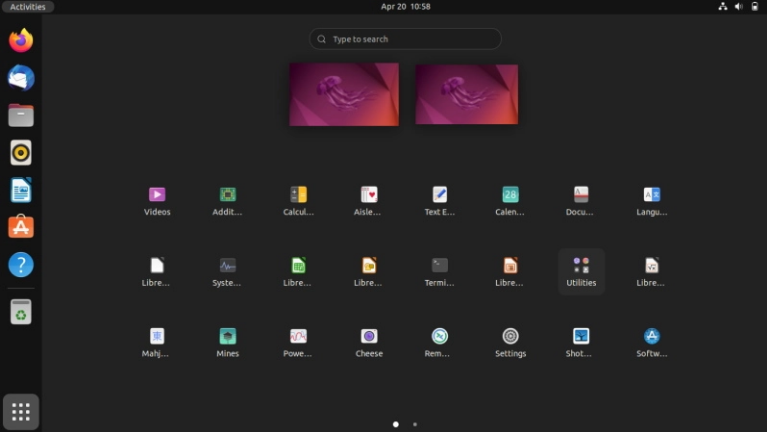
The Activities menu can also be accessed by swiping three fingers across the screen. Ubuntu 22.04 lacks a horizontal dock panel. The app menu has also been updated. It displays virtual desktops in addition to applications:
Multitasking
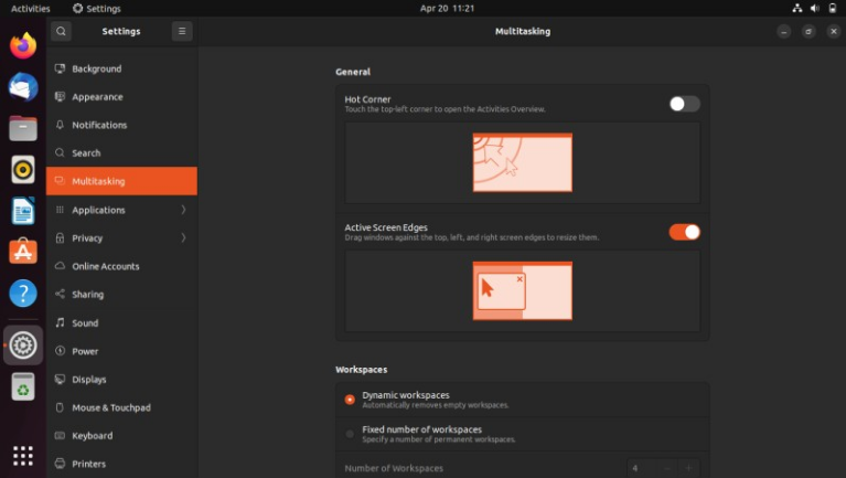
To configure multitasking and employ hot corners, screen edges, and workspaces, there is a dedicated menu item in system options in Ubuntu 22.04. In Ubuntu 20.04, this is not the case.
Linux Kernel Version
Depending on the product, Ubuntu 22.04 employs a variety of kernel versions. The 5.15 LTS kernel is used in the desktop version. The Linux kernel 5.17 is available in the OEM edition of Ubuntu for certified devices. Furthermore, the desktop version use the HWE kernel, which receives rolling upgrades. Ubuntu utilizes a kernel without rolling updates, version 5.15 LTS, for the server.
At the same time, at the time of writing, Ubuntu 20.04 is running the kernel version 5.13.
Customize the Dock Panel
In Ubuntu 22.04, you can compress the dock panel to change the system’s default appearance. Disable the panel mode in the appearance options to accomplish this.
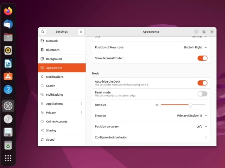
Perhaps this isn’t a big deal, however many people prefer a compact dock panel to the panel that takes up the full left side of the screen in Unity.
Screenshot tool
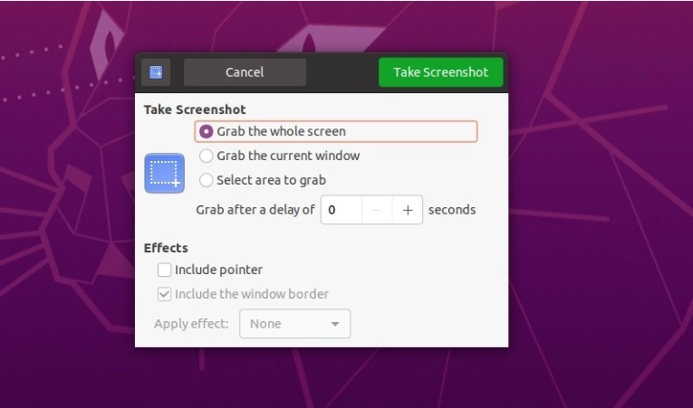
For Gnome screenshots, Ubuntu 20.04 used a standard application. It was straightforward and efficient.
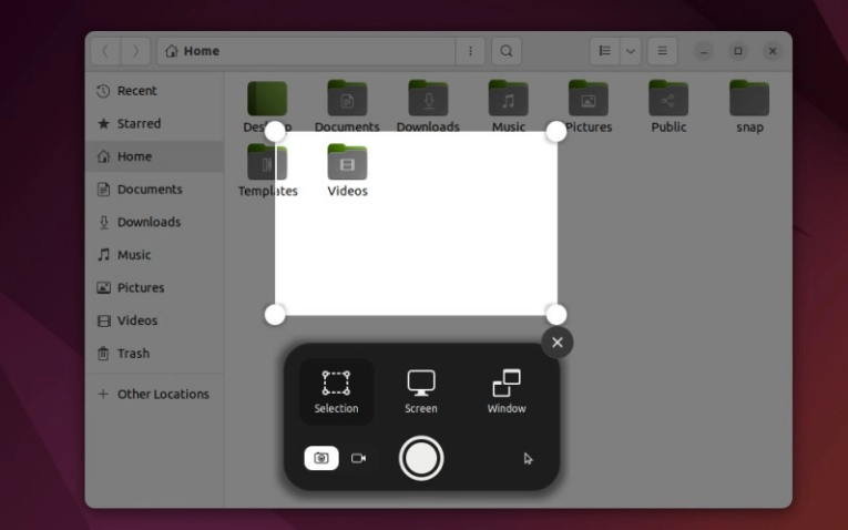
The utility received a significant change in Gnome 42. It now has a more current look and the ability to record video from the screen:
File manager
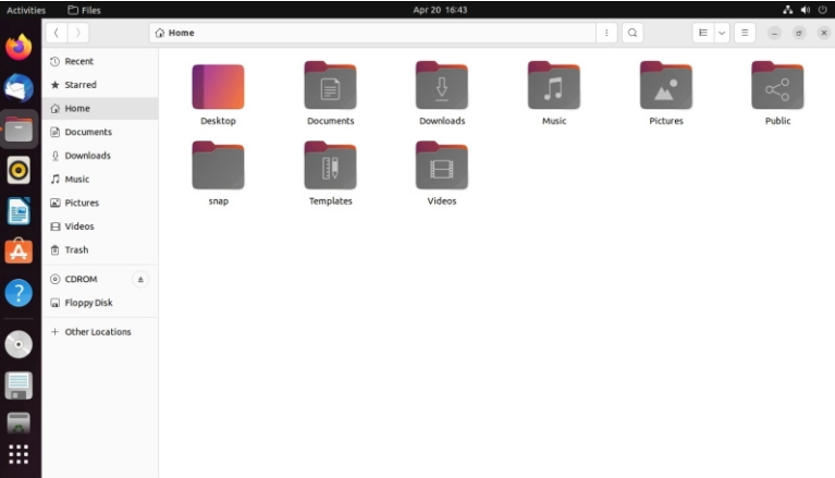
When compared to Ubuntu 20.04, the appearance of the file manager has also been modified. The normal theme from Ubuntu 20.04 is no longer available in 22.04, and everything now appears somewhat different:
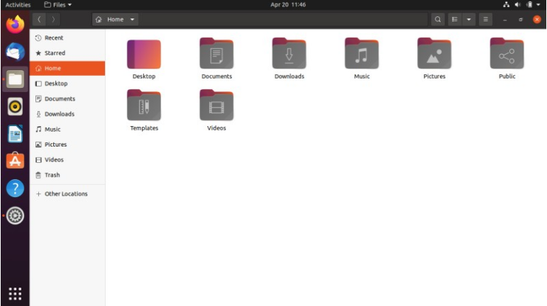
And here’s what the file manager looked like in Ubuntu 20.04:
App center
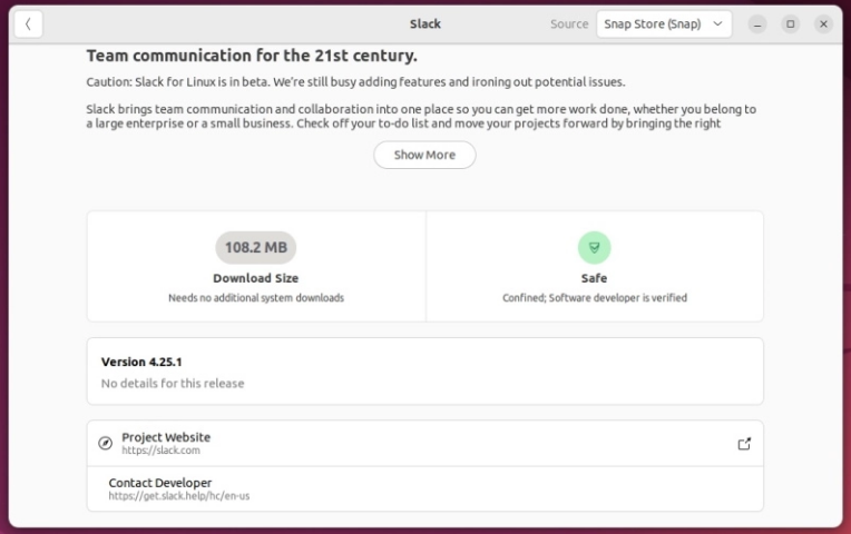
The app center in Ubuntu 22.04 has been changed, and it now displays more information about the product, ratings, project details, download size, and so on.
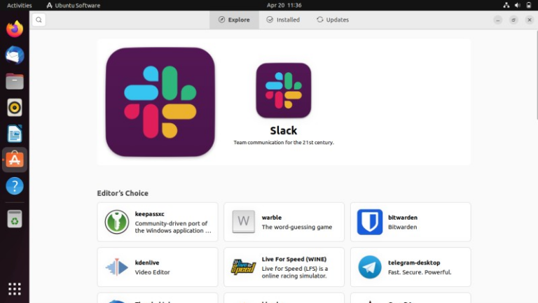
The app center received a few updates in Ubuntu 20.04, but far less than in 22.04.
Firefox now available with Snap
The Firefox web browser will be preloaded as a snap package in Ubuntu 22.04. The snap package adds sandboxing capabilities to the browser, making it safer to use and making it easier for Mozilla to deploy updates. It will also cut down on Mozilla’s efforts to provide a large number of packages for various distributions.
Location of shortcuts
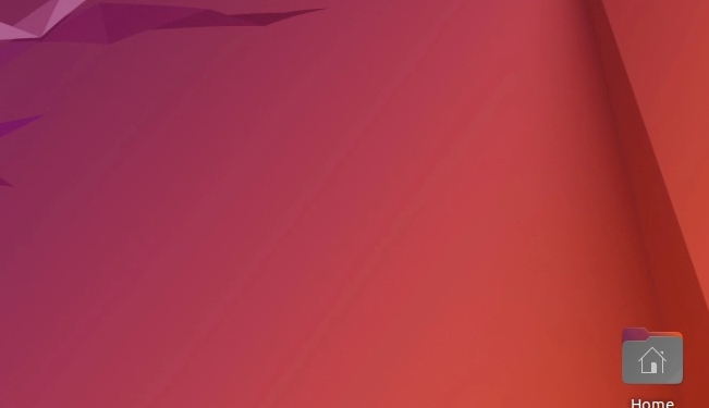
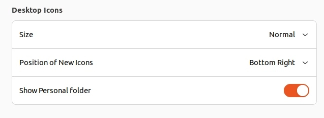
The default desktop shortcut placement has been relocated to the screen’s lower-right corner.
You can, however, adjust this in the appearance settings:
Conclusions
In terms of user experience, Ubuntu 22.04 LTS is unquestionably superior to Ubuntu 20.04. Some of the improvements may not be as useful as they appear, so consider what you require while selecting Ubuntu 20.04 or 22.04.
What are your thoughts on the distinctions between the two LTS releases? Are these sufficient to warrant an update? Leave your thoughts in the comments!




Discussion about this post