Contents
In order to let everyone understand the principles of layout and routing, the code functions implemented in this chapter are not complete, so the source code of this chapter is separated from the main tutorial code library. Interested readers can download the source code of this chapter for reference through the following link:
What is the layout?
Imagine you recently moved to a new room, the room is not big, but you have a lot of luggage to put in. In order not to make this room messy and difficult to find what you want, you decide to plan this space well. Where to start? From large items to small items, the bed is best to face the balcony, and the desk can be close to the window so that the view is better. The cabinet is placed in the aisle, and the shelf is divided into multiple grids. Books, cups, daily necessities are placed separately…
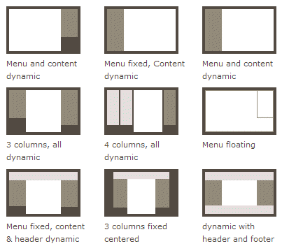
Did you find it? You are laying out your room, putting things in the right place, making it easy to find and pleasing to the eye. In fact, the web page layout is similar. Web pages are essentially a medium for information presentation and transmission. In the general interaction design phase, the first thing to determine is the layout of the web page. Because there is a lot of information to be conveyed to the user, random stuffing on the page will make the information acquisition cost high. The same as decorating a room, you need to put the right information in the right place. Web page layout is the skeleton of information organization. A good web page layout can make information organization clear and clear, and the web page can complete information transmission more efficiently. Users can obtain the required information at a small cost and grow and operate the entire website. Maintain the stability of the information structure. The following figure shows some common web page layout methods:
Props.children and container components
To know how to React to achieve layout must first understand the container class components and {props.children} usage. There is a type of component that acts as a container. It defines the structure of the outer layer, and then you can put any content inside. This is a very common structure, such as a Card component. The component itself is a component without any content. Square container, we can pass in any content when using this component:
We can easily implement this kind of container component:
class Card extends Component {
  render () {
    return (
      <div className='card'>
        <div className='card-content'>
          {this.props.content}
        </div>
      </div>
    )
  }
}

// For example, rendering a div containing the words "Ant Design Practical Tutorial"
ReactDOM.render(
  <Card content={
    <div>
      Ant Design Practical tutorial
    </div>
  } />,
  document.getElementById('root')
)
We give Card incoming component content attribute that can be passed any JSX structure, and then Card internally through {this.props.content} the rendering of content on the page. But this use is not elegant, if Card there are other attributes, and other properties of this JSX will mix together very bad maintenance. It will be much more convenient if component tags can also write embedded structures like normal HTML tags. such as:
eactDOM.render(
  <Card>
    <div>
      Ant Design Practical tutorial
    </div>
  </Card>,
  document.getElementById('root')
)
In fact React.js default to support such an approach, all JSX structures nested in the assembly are available through the internal components props.childrenacquired
class Card extends Component {
  render () {
    return (
      <div className='card'>
        <div className='card-content'>
          {this.props.children}
        </div>
      </div>
    )
  }
}
React.js puts our nested JSX elements into an array one by one and then passes them through {props.children} Card, and then JSX will display the JSX in the array one by one.
This nested content became props.childrenthe the mechanism allows us to write the array of components becomes very flexible, we can even put JSX internal components of elements in the array placed in different places:
class Layout extends Component {
  render () {
    return (
      <div className='two-cols-layout'>
        <div className='sidebar'>
          {this.props.children[0]}
        </div>
        <div className='main'>
          {this.props.children[1]}
        </div>
      </div>
    )
  }
}
This is a two-column layout component. The first structure of the nested JSX will become the sidebar, the second structure will become the content bar, and the rest will be ignored. In this way, through this layout component, we can highly reuse our layout in various places.
Use Ant Design to implement basic layout
Understand the container components and props.children, then we see how to use Ant Design to achieve a set of the standard layout. Ant Design provides a variety of layout methods. For example, the following figure is a typical layout method. This layout can be divided into three information blocks: top navigation Header, sidebar Sider, and content area Content.
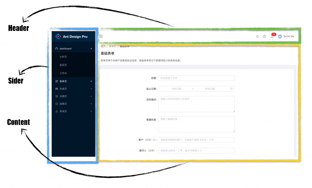
Below we implement the above layout step by step based on the project in the previous section.
Step 1: Add the basic layout
In the srccreation directory layout file directory, then create a index.jsfile, index.jswe write:
import { Component } from 'react';
import { Layout } from 'antd';

// Header, Footer, Sider, The Content component is under the Layout component module
const { Header, Footer, Sider, Content } = Layout;

class BasicLayout extends Component {
  render() {
    return (
      <Layout>
        <Sider>Sider</Sider>
        <Layout>
          <Header>Header</Header>
          <Content>Content</Content>
          <Footer>Footer</Footer>
        </Layout>
      </Layout>
    )
  }
}

export default BasicLayout;
The above code, we create the basic layout of a three-part: Header, Content, Footer. Then we will Contentreplace { this.props.children }, so we set up after routing switches will be achieved by replacing the contents of the variable children.
<Content>{ this.props.children }</Content>Step 2: Add style
Above we defined the structure of the navigation, below we add some styles to make this layout look more beautiful:
import { Component } from 'react';
import { Layout } from 'antd';


const { Header, Footer, Sider, Content } = Layout;

export default class BasicLayout extends Component {
  render() {
    return (
        <Layout>
        <Sider width={256} style={{ minHeight: '100vh', color: 'white' }}>
          Sider
        </Sider>
        <Layout >
          <Header style={{ background: '#fff', textAlign: 'center', padding: 0 }}>Header</Header>
          <Content style={{ margin: '24px 16px 0' }}>
            <div style={{ padding: 24, background: '#fff', minHeight: 360 }}>
              {this.props.children}
            </div>
          </Content>
          <Footer style={{ textAlign: 'center' }}>Ant Design ©2018 Created by Ant UED</Footer>
        </Layout>
      </Layout>
    )
  }
}
Step 3: Configure routing
After defining the container components, we can render the components corresponding to the routes into the container components by way of routing configuration. How to configure the specific routing is described in the following chapters. Here we directly config.js add routing configuration:
routes: [{
    path: '/',
    component: '../layout',
    routes: [
      {
        path: 'helloworld',
        component: './HelloWorld'
      },
    ]
}],
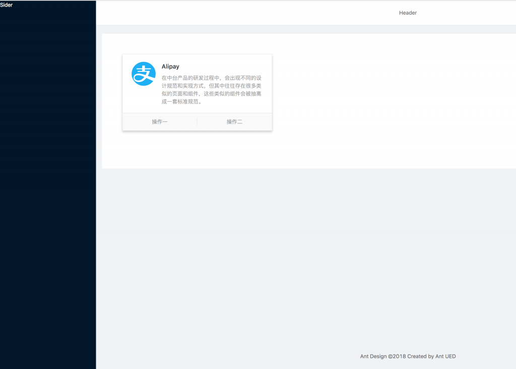
localhost:xxxxThe display effect of this access (pay attention to the port in your command line) is as follows:
Conclusion
Congratulations, so far we have achieved a basic web page layout.
Currently our sidebar is empty. In the next chapter, we will design and implement a typical sidebar.




Discussion about this post